Content Designer, Graphic Designer, UX/UI Designer
2020–2026
AllSides
Figma, Adobe Photoshop, Adobe Illustrator, Affinity, Canva, Drupal
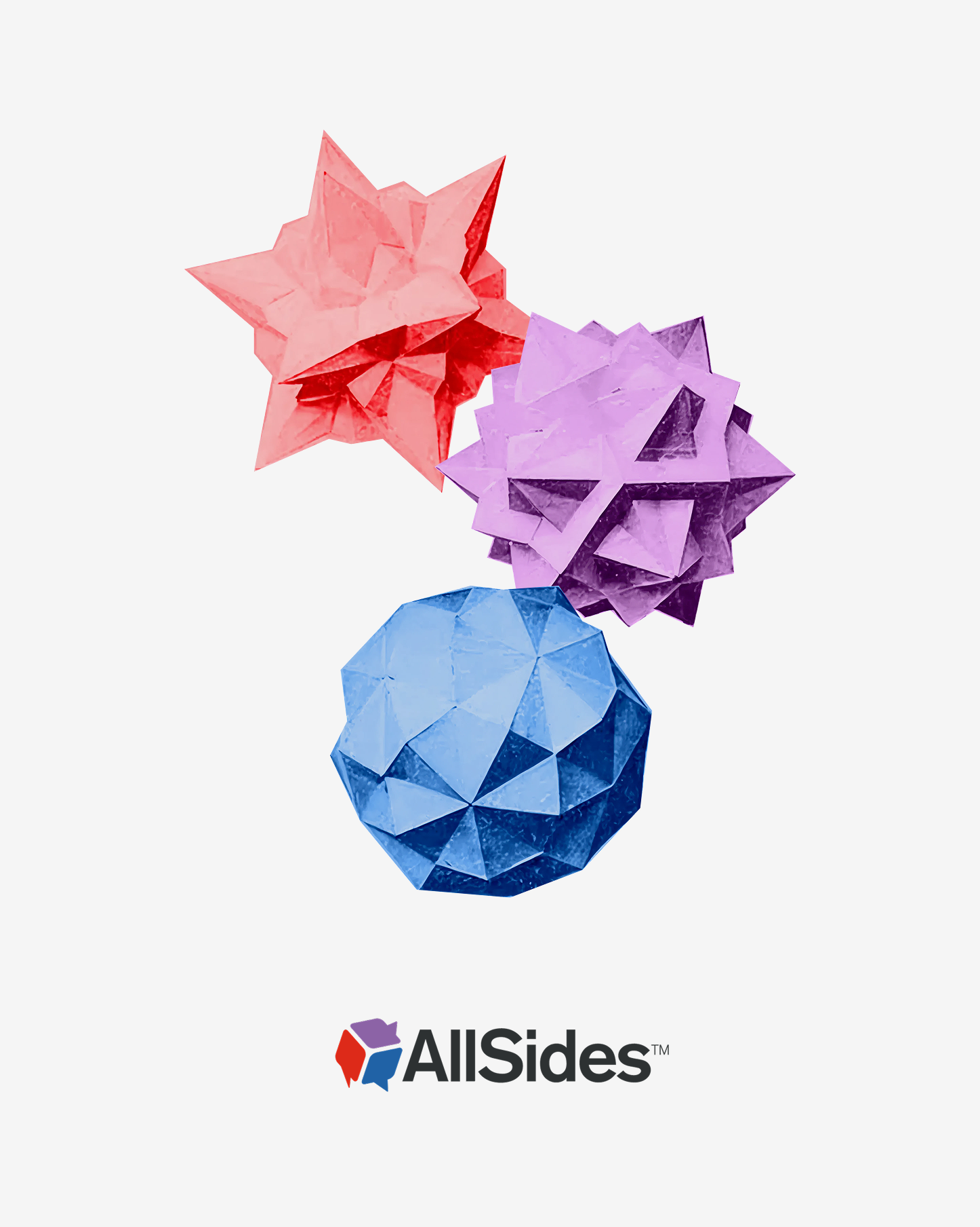

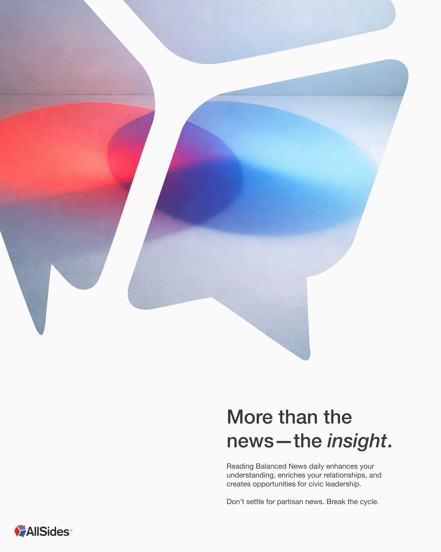
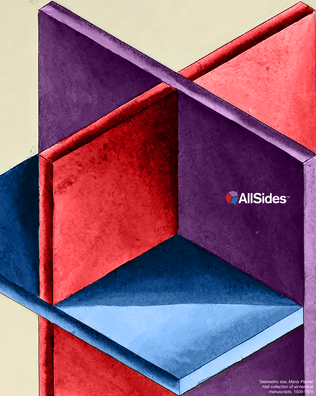
AllSides presents itself as a smart, tech-savvy organization focused on everyday Americans. To support this brand image, I designed graphics with a colorful and approachable digital-scrapbook style. This helped AllSides content feel like it belonged in the same tier as competing online tech-savvy sites like The Verge and Axios. Several of these images accompany articles I wrote.

AllSides brands itself as a smart, tech-savvy, online-first outlet. To support this brand image, I designed graphics with a colorful and approachable digital-scrapbook style. This helped AllSides content feel like it belonged in the same tier as competing online tech-savvy sites like The Verge and Axios. Several of these images accompany articles I wrote.


I used Flourish to create a handful of interactive charts for an article analyzing web traffic data for the top 100 most popular news websites in the US.
Coworkers had collected the data, inspired by a previous article I had written a couple of years earlier on the topic. I learned Flourish from a coworker who had effectively implemented the data visualization platform in articles and other pages on the website.

I led the redesign process of a news website’s Facebook and Twitter profile banner images.
The lead stakeholder noticed that the banner images on the company’s Twitter and Facebook profiles were a bit outdated. She wanted new images created and was “down to experiment with this,” but required that the new design included two of the company’s slogans.
I researched competitive best practices and submitted a handful of options for the team to review. I then worked with various team members to iterate and come up with a solution the lead stakeholder was happy with.

I conducted a competitive analysis of other news platforms’ Twitter banners.
Key findings:
Since the company was fully remote, there were no photos to use for the “established media” approach. The best opportunities for emulation were tech-based platforms and brand/logo signifiers.
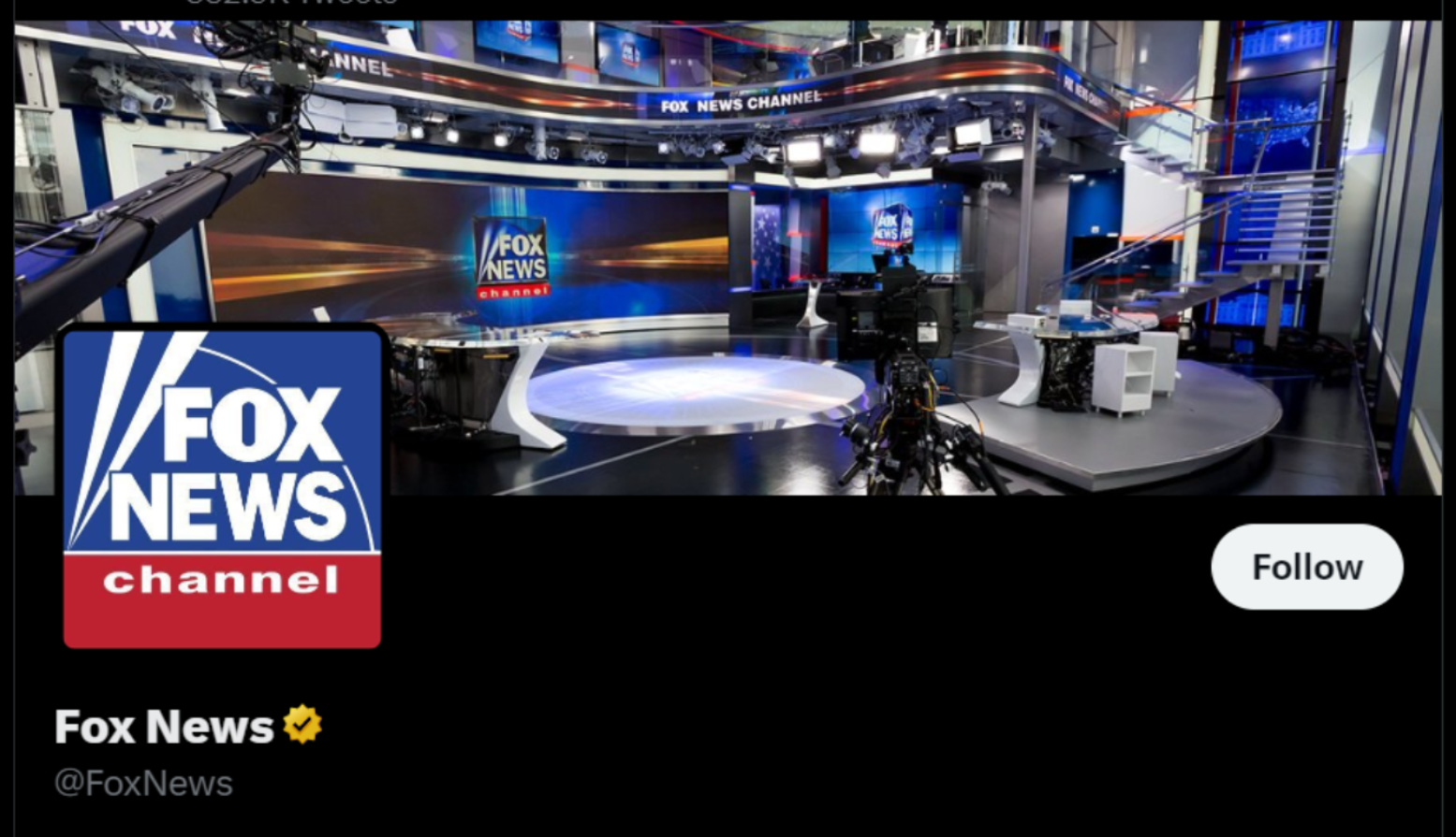
Established news organization highlights newsroom

Tech-savvy news organization highlights mobile presence

Web-native newsletter focuses on their brand