Birth Story Microapp Concept

CMU MA in Design | February-March 2025
Evaluative Research
UX/UI
Mobile
OVERVIEW
Births are some of the most meaningful stories we tell, and today's tech makes it easier than ever to capture information about births. However, because birth can be a disorienting experience, moms often can't capture this information in the moment or organize it for retelling.

Birth Story is a microapp concept designed to facilitate recording, recalling, and reflecting on key moments in the story of a birth. It is designed to exist within the product ecosystem of Myana, a postpartum support app being designed for UPMC by Pittsburgh-area design studio Dezudio.
MY ROLE
Paired with another design student, I contributed to every step of the design process—including initial research, iteration, evaluation, documentation, and presentations for client feedback.  

We primarily collaborated in Figma, with in-person and remote meetings for decision making. My project partner also made significant contributions to the design of presentations and mockups.

This project was assigned as part of an Interaction Design Studio course at CMU. While we designed for a real use case and got feedback from a real client, this project did not involve working directly with or for UPMC or Dezudio in a professional capacity.
TEAM MEMBERS
Diane Hu
A set of screens from the Birth Story app concept
FEATURES
01
Adding Moments
Users need to know when moments occurred and what information they contain. Cards display the time of a story moment and the types of information visible in each entry.
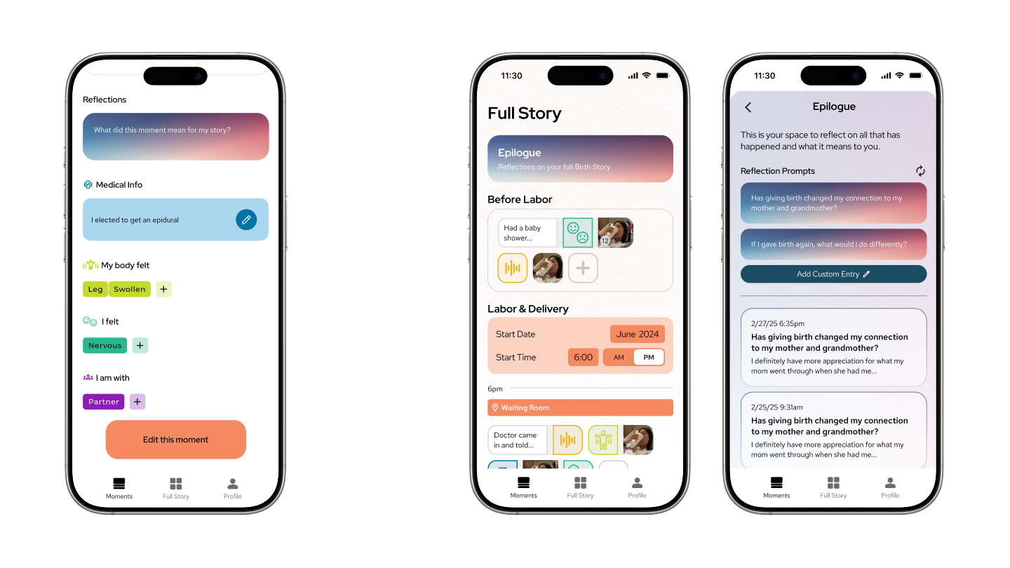
Contextual Details
For most moments, it's enough to record when, where, and what happened. When users want to go deeper, they can add contextual information about their body, emotions, and visitors.
Review and Edit Info
By tapping on a moment card, users can review what they recorded — 5 weeks after birth, or 5 years. Every part of this moment is editable, to keep control in the user’s hands.

Reflections
Now that information has been entered, meaning can be layered on top. This functions the same as a text entry, but with a different purpose.
Chronological View of the Full Story
People tend to tell stories in the order in which they happened. To facilitate this behavior, this screen gives users the information they’ve entered in chronological order. Starting with the onset of labor, this information is displayed hour-by-hour.

Measuring Time Differently
Stories specifically about labor usually measure time in hours. But full birth stories also span days or even weeks before and after delivery. Those moments get their own separate sections in the Full Story timeline.
Epilogue for Reflections
People reflect on meaningful moments, but they also make meaning of the overarching narrative. This is the place for the latter.

Reflection Prompts
Sometimes, people don’t know how to process what's happened to them. Prompts, delivered here and optionally via daily notifications for two weeks after delivery, guide the reflection process. These focus on the user’s connections to the past, the future, and the people in their lives.
The Main Character
Activity surrounding birth is often focused on the baby, but the birthing parent is the hero of this Birth Story. Here, general information like due dates, age, name, and more may be entered.

Let Others Support You
Interview participants emphasized that they can’t fidget around with apps when they’re in labor. On the other hand, they said photos, videos, and other records would be a "gift" to receive after their ordeal. Thus, in our app, loved ones can contribute using a simple share link.

Medical Info Quick-Access
Wait, what did the doctor say? Medical information needs to be recalled more quickly than narrative events, so each medical entry gets collected here.

Export to Book or PDF
No app lasts forever. Users get the option to put their story in a format they can take with them.
WHAT ARE BIRTH STORIES, AND HOW ARE THEY TOLD?
RESEARCH & IDEATION
02
Building on Formative Research
To find a unique approach to the problem space, we used a combination of interviews, observations of birth vlogs, competitive analysis, and journey mapping. Because my project partner and I had with little firsthand experience with birth, we needed research to build an understanding of the birth experience.

Research by our professors had already established that birth can be emotionally charged and potentially traumatic. Because it is disorienting, new moms are often fuzzy on the details and struggle to make sense of what happened, even when everything goes normally. Some new parents don’t feel listened to or feel handled—they feel a lack of control.

I gained a lot of insight by asking my own mother to recount the story of my birth. She described three key chapters: the days leading up to the birth, the day of the birth, and the aftermath. Some details she remembered clearly, but others were fuzzier. Time, place, people, and feelings were key elements in her retelling. These became key anchors for our design.
Mapping Birth Stories to Storytelling Structures
We noted that the events surrounding birth roughly matched rising and falling patterns in some common story structures. Anticipation builds, the characters might leave a familiar environment, events reach a climax at birth, and the characters return home, having changed.

This structured sequence of events helped us outline a user flow for the use of a mobile application during this experience.
A SYSTEM for Collecting Moments of your Story
INITIAL UI ITERATIONS
03
Key Concepts: "Moments" and "Full Story"
We conceived of the birth story as a series of events, or "moments," taking place over time, culminating in a "full story." 

In our initial UI wireframes, users would have a chronological feed of moments, add to it, and then a separate place to get an overview of all of their moments at once. Because births are often hectic and disorienting, we opted for a large, simple "add" interaction at the top of the moments feed.
Implementing Client Feedback
We presented our progress to the client and implemented their feedback, including by adding an onboarding flow, adjusting the moments and full story screens, and adding a new "Reflect" section to support intentional meaning-making after the birth.
Onboarding Flow
We wanted to plan how to instruct new users on the app's features, in case they were not intuitive. However, skip-ability and conciseness were priorities. This version also included an initial (optional) data entry screen, to start the process of information recording and to facilitate any eventual personalization.
Moments and "Timeline"
We simplified the moments feed but adjusted the moment cards to prioritize time, the key variable in a "moment." To save limited screen space, we reduced the "add" button's size and placed it at the bottom of the screen, within easy access of the usual user's thumb. We added a top-right toggle to swap between feed and zoomed-out views, to free up bottom navigation space. And finally, we raised the fidelity of all screens to embody a friendlier, cleaner design.
Facilitating Reflection
Our wireframes for "Reflect," a new section of the app, featured suggested reflection prompts and common UI patterns for notes or journals on smartphones.
What do New Moms Think?
User Interviews
04
Testing Plan
We showed our designs to two recent mothers, who graciously volunteered their time and feedback. To prepare,  we wrote a set of research goals and a user testing script. This helped guide our conversations.

Research questions included: 

  • Is this too many onboarding screens?
  • What do they expect will happen when I tap the plus (add moment) button?
  • If they’ve reflected on their birth, what format was that done in? Journal, conversations, etc? Would this format be useful?
  • Do moms emotionally resonate with how we’ve constructed the app experience?

We discovered that...

  • The onboarding flow could be simipler. However, certain questions, like "Is this your first pregnancy?", could be triggering for some moms. We removed these.
  • The plus (add moments) button made sense to them.
  • People reflect in their own ways. One participant suggested the app reflections might be added into the moments timeline, and another said they'd just use their own journal. In-app reflection needed to be optional and integrated with the other app flows.
  • Apps don't last forever, and these participants indicated they wouldn't want to record these kinds of precious moments unless it was, or could be, permanent. Somehow, the birth story needed to make it outside of the app.
  • It was not feasible to expect moms to enter anything during any stage of labor, even earlier stages. Thus, it was important to facilitate a close circle of supporters adding moments.
"I really think this is an app for partners, or support people to do for the mom. And I almost feel like this would be such a good giftto have because you're in such a delirious mode no matter how you give birth."
"I don't even know where my phone is."
"I don't know, necessarily, if I would journal in an app...if it's something that I want to keep, because, you know, apps change...I would like to have it in a paper form."
"The whole reason I think I would invest my time into building out this app would be, having a place I could come back to in 5 years, 10 years, 50 years, to either have it printed out, or like, see it."
An App for Moms & Families
Applying research to UXUI
05
Research-Based Change: Integrated Reflection
We realized that "Reflect" needed to be an integrated part of the user experience, not a separate section. Thus, we incorporated
Research-Based Change: Support Group
The information within the app belongs to the mom using it—that couldn't change. What users needed was a way for their loved ones to contribute to their stories—to give the "gift" of moments they couldn't capture by themselves.

From their Profile page, moms can share a link to give loved ones access to a limited, web-based version of the "add moments" function. This keeps outside contributions relevant and facilitates quick, in-the-moment sharing in potentially frantic situations.
Research-Based Change: Export
There was a clear need for some way to take your Birth Story out of the app. We chose to imagine three ways of doing this: Save Your Files (free), Export to PDF (free), or Export to Book (paid, third-party).
Visual Style
We crafted a style prioritizing warm colors and rounded shapes to help new moms feel safe and comfortable. We used typography and semantic colors aligned with Myana, the parent app designed by our professors.
Reflections
06
A set of screens from the Birth Story app concept
Don't Reinvent the Wheel
We made use of several icons and UI components by Google and Apple, which sped up our design process significantly.
Talk to People
We learned far more from actually talking to moms than we did from researching online. Conversations were a key tool — not just for identifying new concepts, but also for validating or prioritizing existing concepts. We had thought about export and supporter features early on in the process, but we didn't realize how essential they would be until we talked to our target audience. It wasn't just us — other student groups had similar experiences.