A mockup of screens from the Trinity Church of Austin website redesign.

Trinity Church of Austin: Accessible Website Redesign

Knowbility Accessibility Internet Rally 2023 2nd Place Winner | September-November 2023
UX Research
UX/UI Design
Project Management
Web
OVERVIEW
I volunteered as a designer and project co-manager on User Experience San Antonio’s (UXSA) team for the 2023 Knowbility Accessibility Internet Rally (AIR), a competition to design and build accessible websites for local nonprofits.

Our client was Trinity Church of Austin, a small LGBTQ-inclusive church in Austin, TX. These characteristics presented unique design questions; how could we provide a fresh look and a usable structure for current church staff, elderly current members, and young families whom the church wanted to attract, all while following accessibility best practices?

Over three months, our team researched the problem space, designed a website, built it in WordPress, and tested it for usability and accessibility. Our project won second place in AIR 2023, passing most web accessibility measures and earning praise from our client and the Knowbility competition judges.
MY ROLE
As a designer, I provided a keen visual eye and a commitment to understanding our target users. I collaborated to facilitate client interviews, craft a visual style, organize site content, and design an interface. I also helped build some elements in WordPress and test for accessibility.

As a co-project manager, I brought diplomacy and enthusiasm to help our 100% remote newly-acquainted volunteer team navigate conflicting expectations and a skill levels. I assisted two other co-managers and the UXSA coordinator in building a project timeline, leading meetings, and writing weekly action items for the team in Slack. ‍
TEAM MEMBERS
Adrienne Palmer, Richard Gower, Matt Berdahl, Dylan Roets, Roslyn Devassy, Kirstin McStravick, Kyle Johnson, Bai Pai
AN INCLUSIVE, ENVIRONMENTALIST CHURCH SEEKING NEW MEMBERS
RESEARCH
01
We knew our first and most important task was to gain an accurate understanding of the church’s identity and the website's intended users.

We discovered that the client, Lead Pastor Rev. Chelsea McCutchin, wanted a modernized online presence that was 1) easy for staff to manage, 2) informative for current elderly members, 3) appealing to prospective members, and 4) true to the organization’s identity.

I led a team interview with our client, using questions provided by team members and categorized by AI in Miro. From this, we learned about the church’s unique identity and culture, including the client’s desire to avoid language and imagery traditionally associated with organized religion. Values like inclusivity and environmentalism came to the forefront. We also learned about the client’s success metrics and desired website features.
User research proved challenging; scheduling conflicts and client preferences prevented us from sending survey questions to actual church members. Since we were all remote, only one team member was able to visit the church in person.

Still, we learned enough from our client to understand our user archetypes as 1) church staff, 2) elderly current church members, and 3) young families interested in an inclusive church experience.

Seeking more insight, I interviewed my father, a Protestant Christian who had a lot of experience shopping around for churches in Texas. This helped us empathize with prospective new church members’ emotional experience when using church websites.
DESIGNING FOR CLIENT VALUES
INFORMATION ARCHITECTURE AND VISUAL STYLE
02
Informed by our client and competitor research, we set out to design an information architecture and visual style that reflected the church’s values.

Our client indicated which sections needed to be included in the site, including a homepage, an about page, contact information, donation information, and information about both Sunday services and other church activities.

We wireframed several ideas for structuring this content in Figma and decided collectively which to implement at higher fidelity.
To craft a visual style, we created a set of style guide options centered on the church’s values, such as inclusivity, community, and nature. For instance, we noted that inclusivity could be signaled by prominently featuring the church’s large rainbow-colored stained glass window, especially when paired with more direct rainbow imagery.

The client selected elements from each of the style options, which helped us find a unified design direction.

We chose Atkinson Hyperlegible as our site font because it was developed by the Braille Institute to help low-vision readers.
We combined wireframes and visual style in Figma, creating high-fidelity mockups of six main pages. We also achieved a stretch goal to design a new Staff page.

Language was key throughout this process. For instance, the client initially wanted information about Sunday services, which the church calls “Celebrations,” under a page of the same name. We advised that this likely would not make sense to prospective members; the final label was “Worship.”

Finally, we made a style guide in Figma to communicate how the brand could be handled more cohesively, effectively, and accessibly on web and elsewhere.
BUILDING AN ACCESSIBLE WEBSITE
TESTING
03
We built the website in WordPress, heavily modifying an accessible WordPress theme. Thanks to our team’s experienced developers, this sometimes included custom PHP code for certain designed elements. We tracked bugs and development tasks in Trello.

We prioritized accessibility by adding alt tags, responsive sizing, and screen reader-friendly content. Our team tested for accessibility issues using four different automatic accessibility checkers, including WAVE, ARC Toolkit, and ANDI.

Finally, we tested the site with a visually-impaired person using a screen reader. Beyond general accessibility questions, we asked him about his assumptions on where to find information about the church’s location and beliefs.
SUPPORTING A FULLY REMOTE VOLUNTEER TEAM
PROJECT MANAGEMENT
04
We began the project by dividing up responsibilities. I volunteered to help with design and project management.

Our project management process strived to be organized and helpful to team members. We used a Gantt chart to iron out our project roadmap, including a week of buffer time at the end.

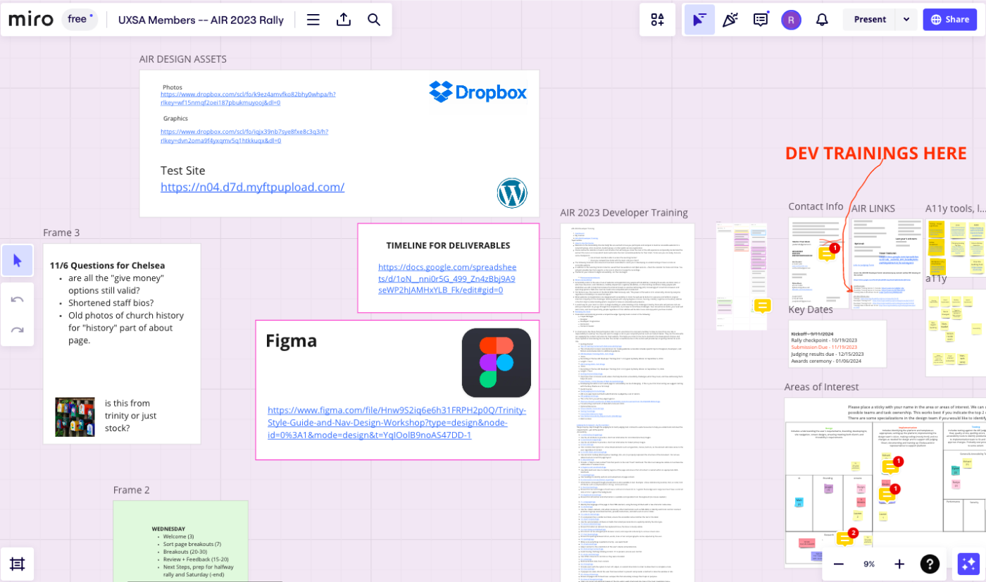
We organized our ideas primarily in Miro, with some discussions in Slack and Figma. To make this effective, we tried to make important links clearly visible to all team members.
REFLECTIONS
05
I’m grateful for my talented and experienced team members who made this experience possible.

Clear Decision-Making
I learned that on design teams—especially newly-formed volunteer design teams—clear communication, expectation-setting, and decision-making is key. In that environment, everyone has different goals and expectations, so teams should get aligned early and fast. Without clear communication, even something as simple as a project roadmap can cause weeks of confusion.

Design for the Long Run
At the end of the project, we volunteers went our separate ways. As far as I know, this disrupted handing the project off to the client. While we tried to design with long-term use in mind, I learned that design is impotent without a clear process for enabling non-designers to control and implement designed products.