
Roles
Research, UX/UI Design, Evaluation, Documentation, Presentations
Deliverables
Product Concept, UX Flows, Research Findings, UI Mockups, Clickable Prototype
TOOLS
Figma, Claude Code
TIME
February–March 2025, August 2026
Collaborators
Diane (Qing) Hu
OVERVIEW
Births are some of the most meaningful stories we tell, but the often-disorienting nature of giving birth can make capturing and reflecting on these stories a struggle.
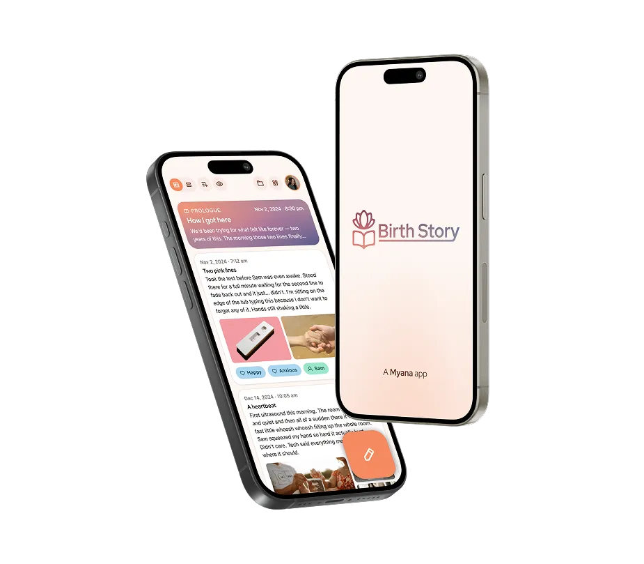
Birth Story is a microapp concept designed to facilitate recording, recalling, and reflecting on key moments in the story of a birth. It was designed to exist within the product ecosystem of Myana, a postpartum support app being designed for University of Pittsburgh Medical Center by Pittsburgh-area design studio Dezudio.
NOTE
This project was part of a graduate interaction design course at Carnegie-Mellon University. While we got feedback from a UPMC client, this project did not involve working directly for UPMC or Dezudio in a professional capacity.
FEATURE Preview
Recording, Receiving, Reflecting, & Retaining
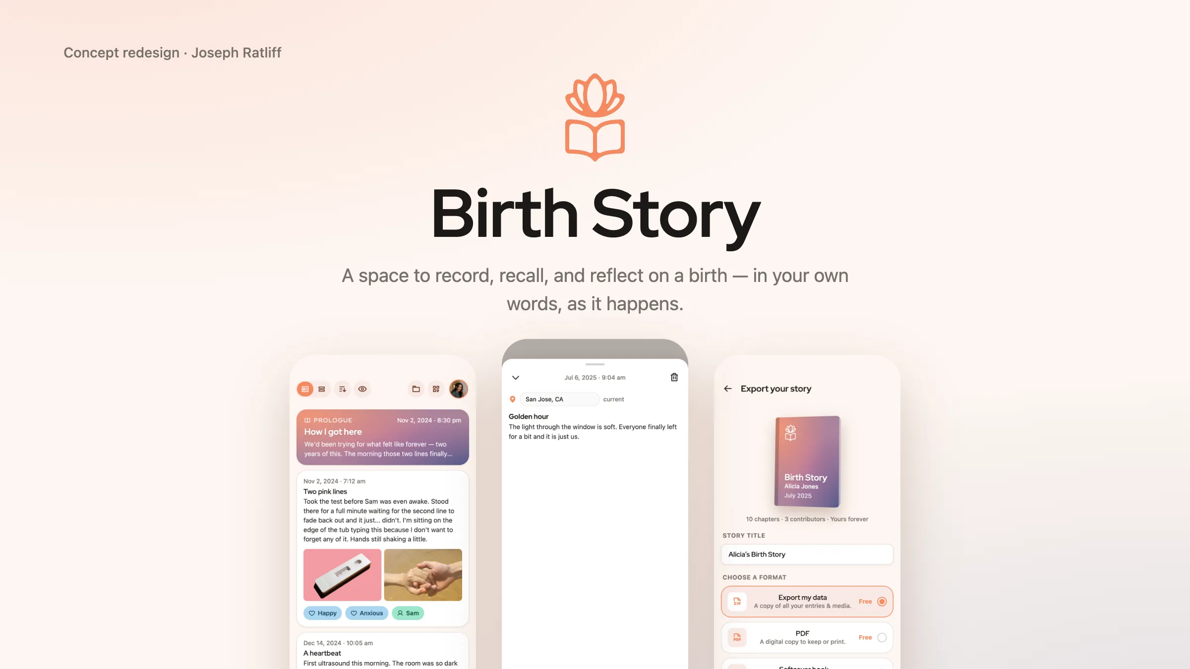
User as Protagonist
Activity surrounding birth is often focused on the baby. Birth Story is a place for moms to record and reflect on their own stories.
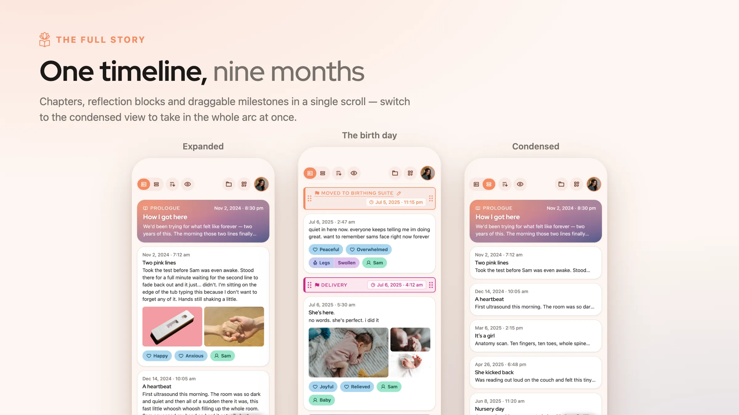
Your Story, Expanded & Condensed
Chapters build into story arcs; a condensed view allows users to see the big picture on one screen.
Prologue & Epilogue
To reflect on the overarching narrative, Birth Story includes Prologue and Epilogue sections.
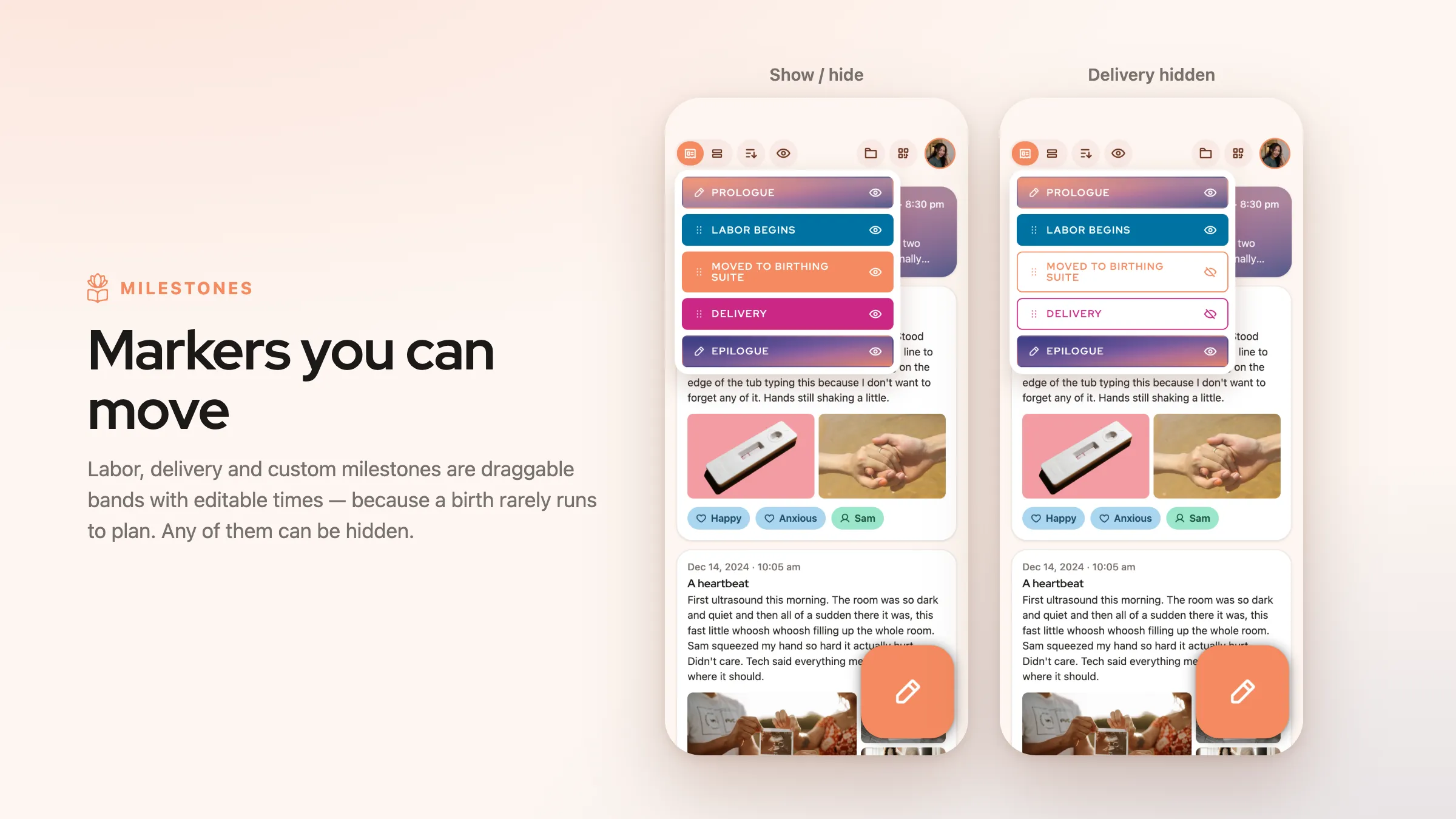
Milestone Markers
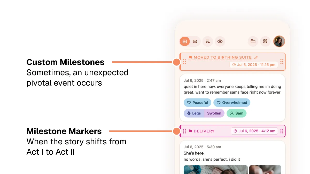
Labor, Delivery, and custom timeline markers allow the user to prominently denote major shifts in their story. Because every story is different, these are hideable and adjustable.
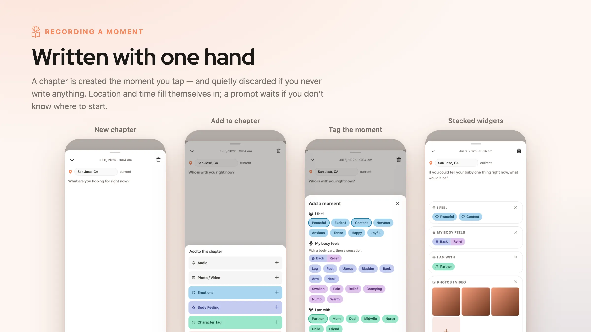
Chapters With Contextual Details
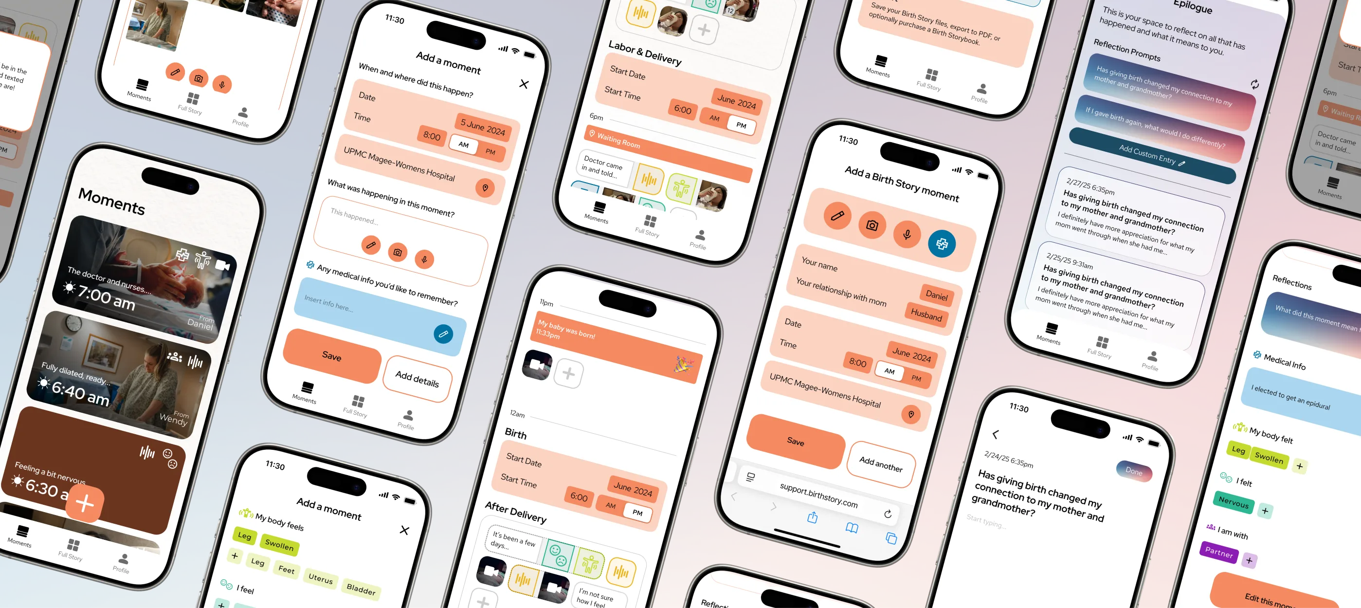
Stories come in chapters. In Birth Story, users record chapters using a simple one-screen flow, echoing common note-taking UI patterns.
Contextual tags incorporate audio, photos, emotions, body feelings, and people — the things that give events meaning.
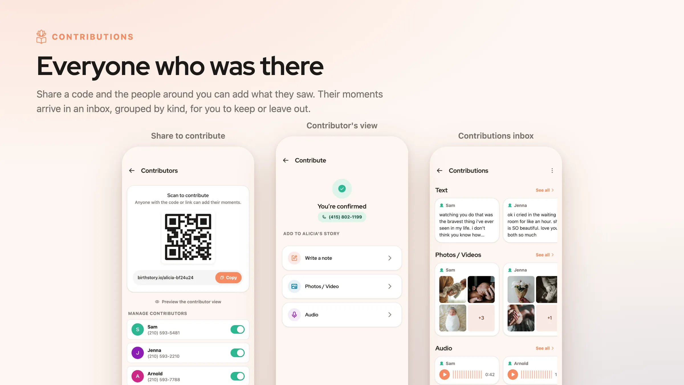
Let Others Support You
Interview participants said photos, videos, and other records would be a "gift" to receive after the more intense parts of giving birth. Thus, Birth Story allows loved ones to contribute using a simple share link.
Privacy is key; contributors are tied to their phone numbers, and users can block them if needed.
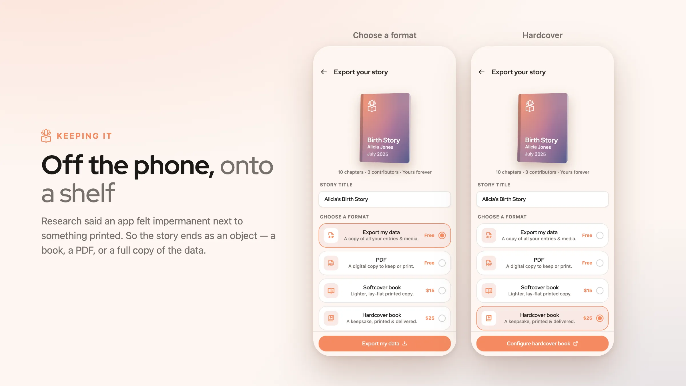
Export to Book or PDF
Interviewees didn't want to enter deeply meaningful information if it only stayed in an app.
With free and paid options, all users can export their info, while paid options fund the project.
RESEARCH & IDEATION
What Are Birth Stories, and How Are They Told?
Building on Formative Research
To find a unique approach to the problem space, we used a combination of interviews, observations of birth vlogs, comparative analysis, and journey mapping. We had little firsthand experience with births, so we needed to build an understanding of the birth experience.
Research by our professors had already established that birth can be emotionally charged and potentially traumatic. Because it is disorienting, new moms are often fuzzy on the details and struggle to make sense of what happened, even when everything goes normally. Some new parents don't feel listened to or feel handled — they feel a lack of control.
I also gained insight by asking my own mother to recount the story of my birth. She described three key chapters: the days before, the day of, and the aftermath. She remembered some details clearly, but others were fuzzier. Time, place, people, and feelings were key elements; these became key anchors for our design.
Mapping Birth Stories to Storytelling Structures
We noted that the events surrounding birth roughly matched rising and falling patterns in some common story structures. Anticipation builds, the characters leave a familiar environment, events reach a climax at birth, and the characters return home, having changed. This structure helped us outline a user flow for the use of a mobile application during this experience.
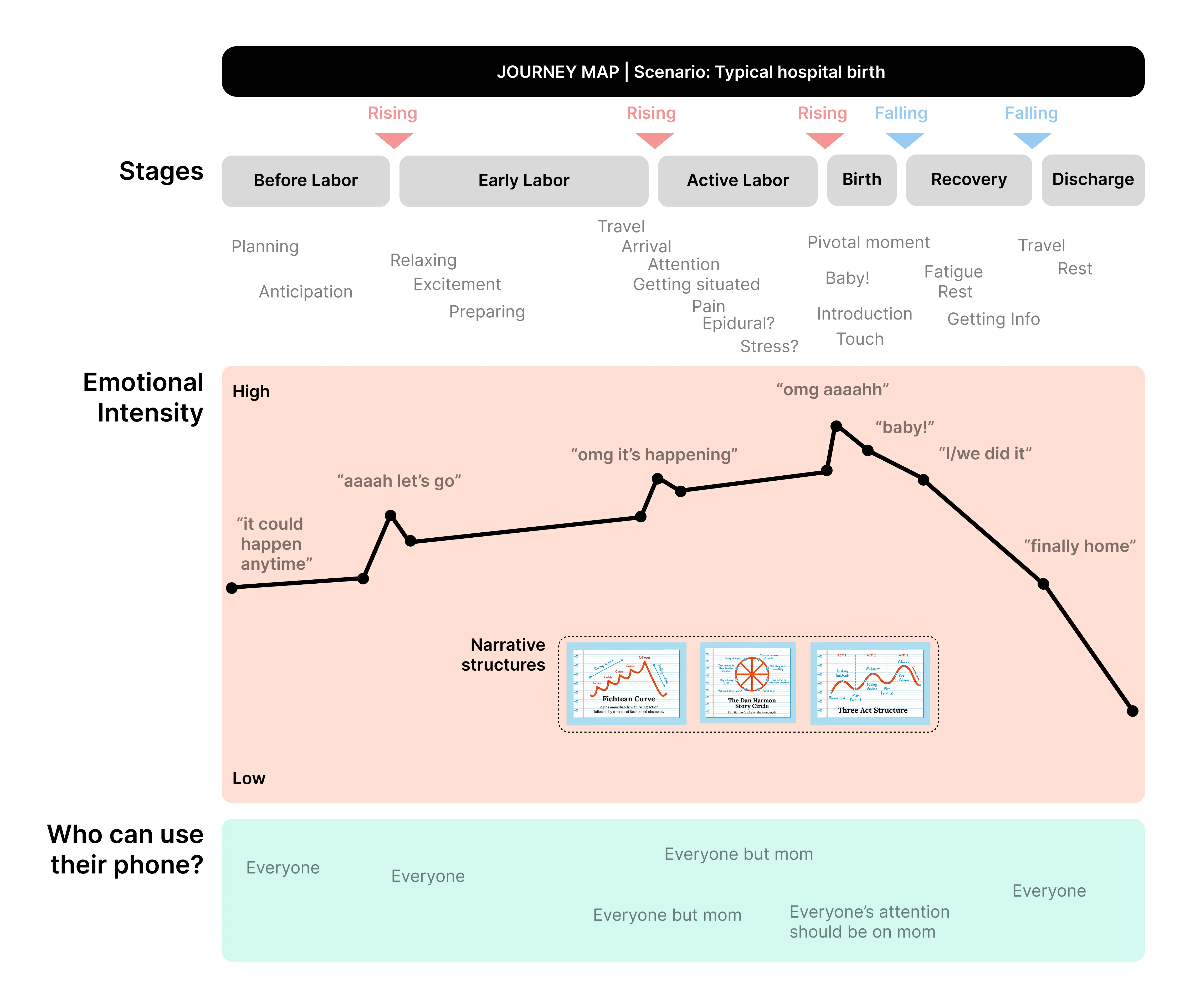
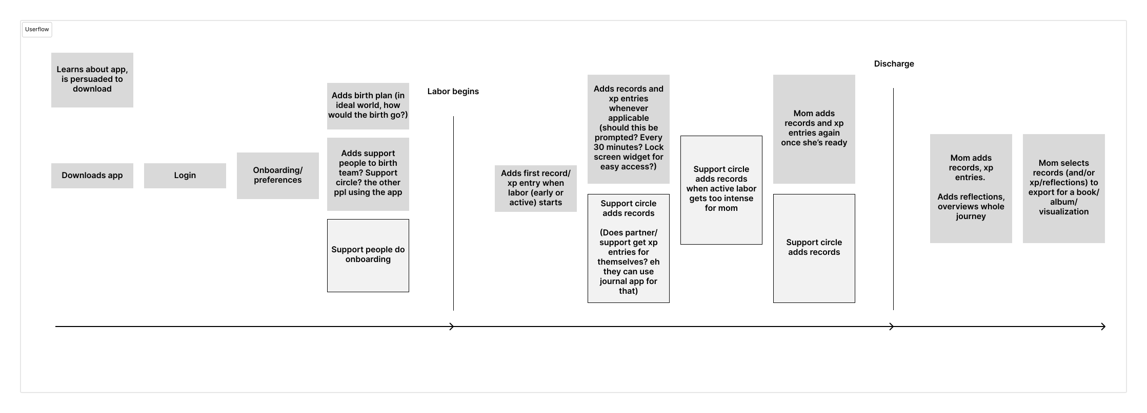
INITIAL UI ITERATIONS
A System for Collecting Moments of Your Story
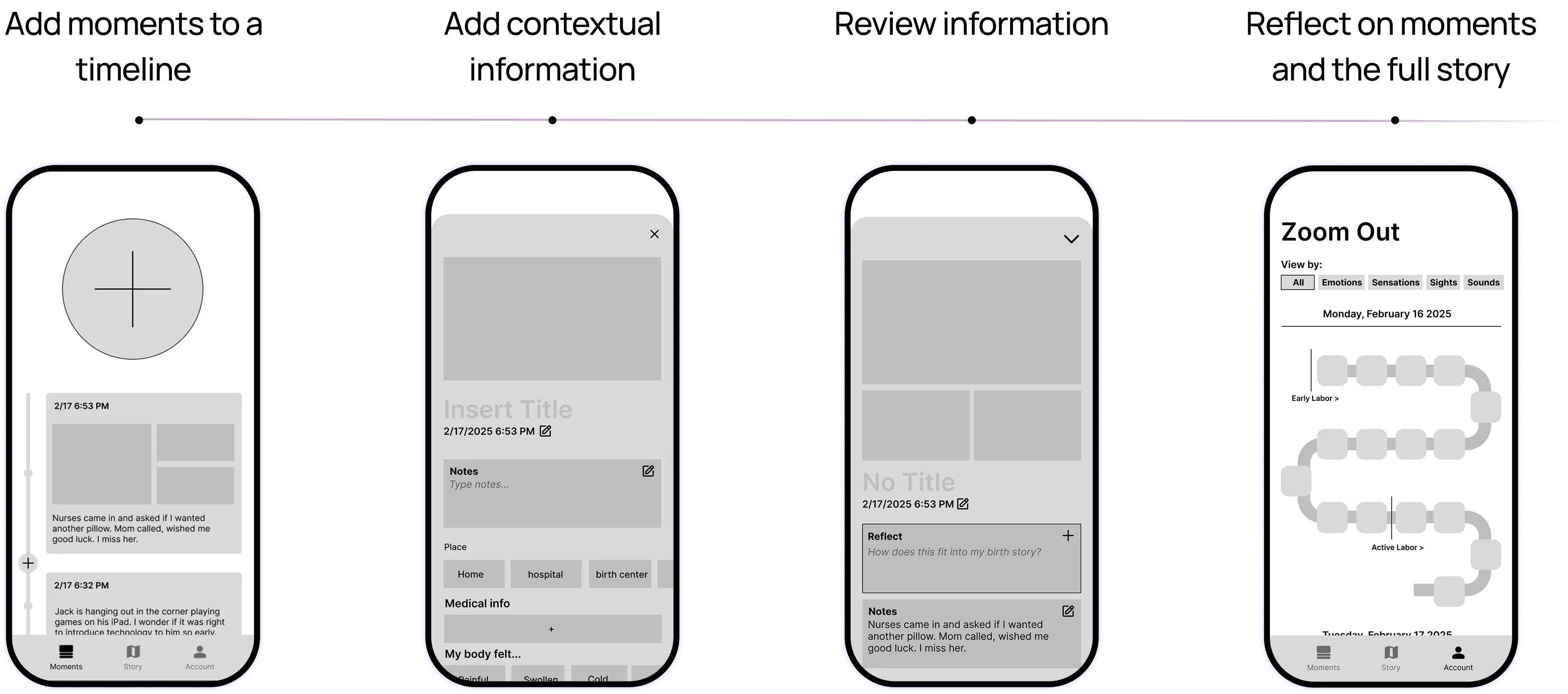
Primary Concepts: "Moments" and "Full Story"
We found that stories, and births, have individual scenes as well as longer arcs. Thus, our initial wireframes had a chronological feed of moments and a separate place to zoom out. Because the birth experience can be disorienting, we opted for a large, simple "add" button.
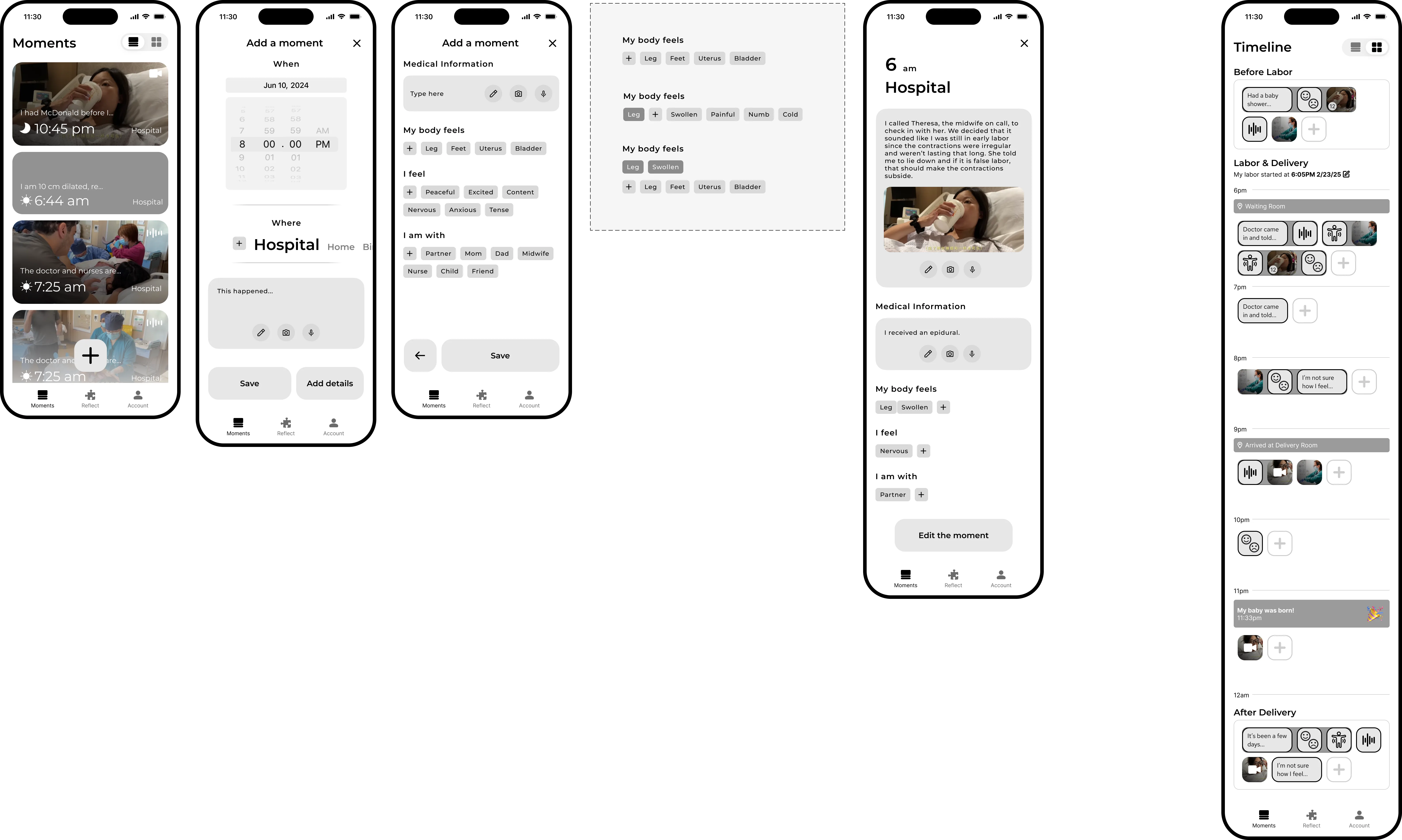
Second Round: Implementing Client Feedback
We presented our progress to a representative from UPMC and implemented their feedback, including by adding an onboarding flow, a "Reflect" feature for sensemaking, and other adjustments to the moments and full story screens.
Onboarding Flow
Conciseness was a priority for onboarding; this evolved as we designed, initially including an optional data entry screen to start personalization and the core info entry interaction.
Moments and "Timeline"
We simplified the moments feed but adjusted the moment cards to prioritize time, the key variable in a "moment." To save limited screen space, we shrank the "add" button and placed it lower, for easy thumb access. To simplify the navigation, we freed up nav spave by adding a toggle to swap between feed and zoomed-out views.
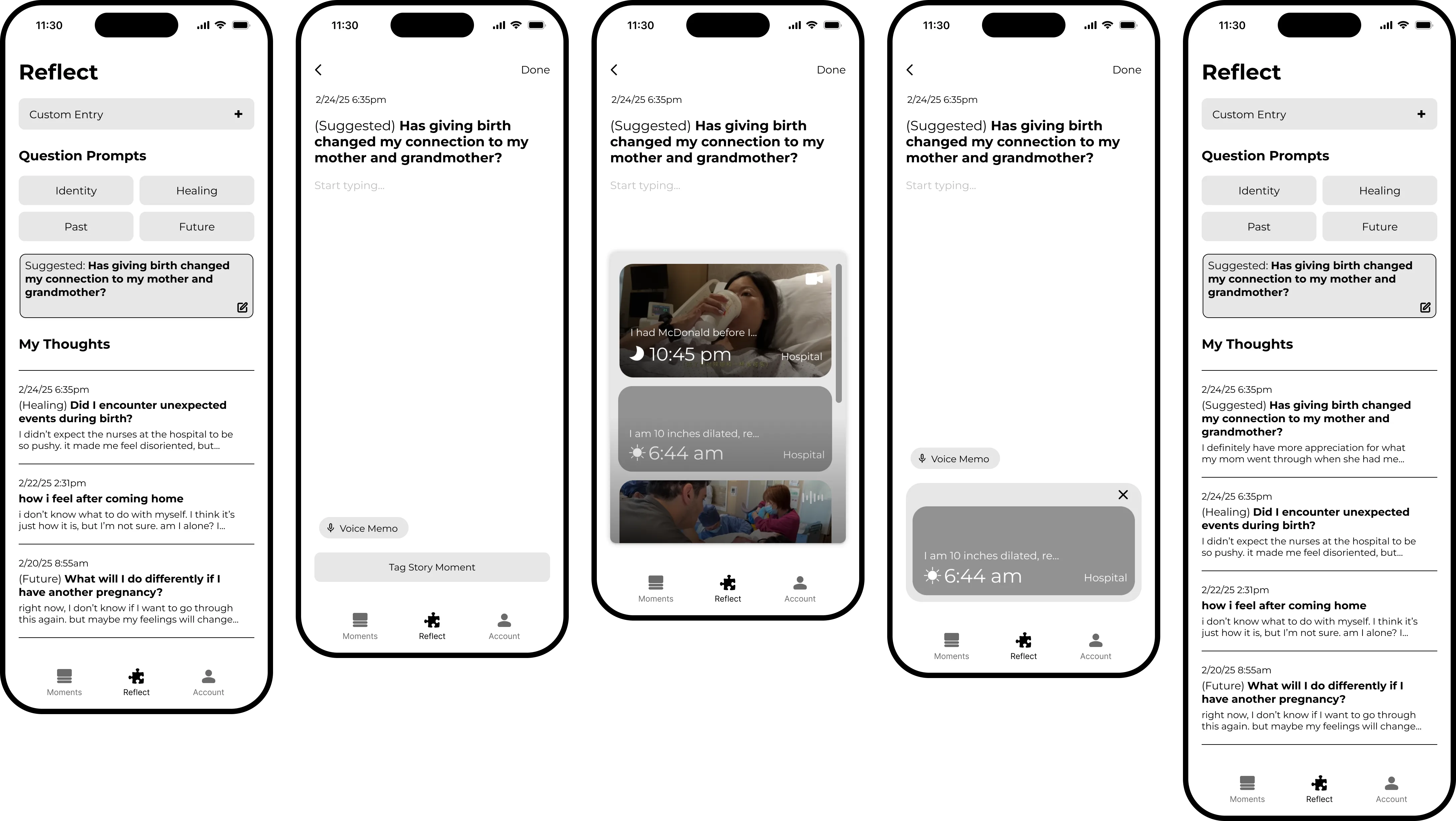
Facilitating Reflection
Our wireframes for "Reflect," a new section of the app, featured suggested reflection prompts and common UI patterns for notes or journals on smartphones.
USER INTERVIEWS
What Do New Moms Think?
Testing Plan
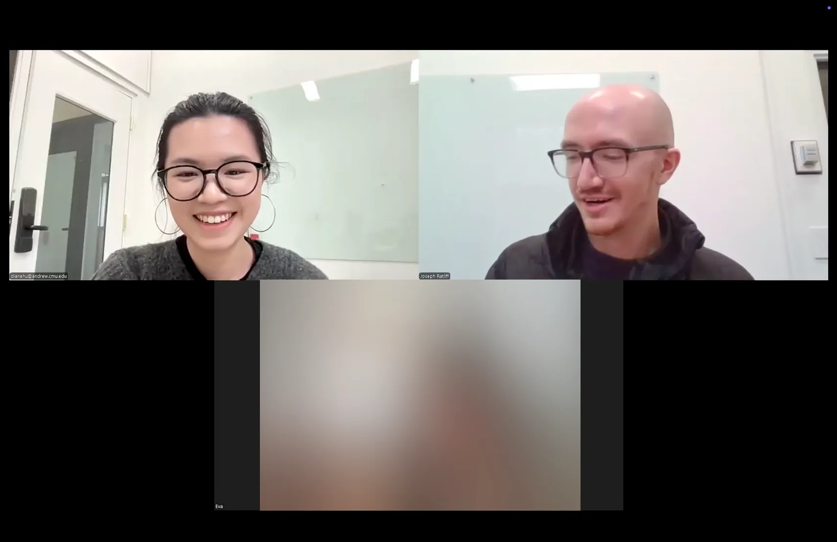
We showed our designs to two recent mothers, who graciously volunteered their time and feedback. To prepare, we wrote a set of research goals and a user testing script. This helped guide our conversations.
Research questions included:
- "Is this too many onboarding screens?"
- "What do they expect will happen when I tap the plus (add moment) button?"
- "If they've reflected on their birth, what format was that done in? Journal, conversations, etc.? Would this format be useful?"
- "Do moms emotionally resonate with how we've constructed the app experience?"
Findings
- The onboarding flow could be simpler, and certain questions like "Is this your first pregnancy?" could be triggering for some moms. We removed these.
- The Add Moments flow made sense.
- People reflect in their own ways. One participant suggested the app reflections might be added into the moments timeline, and another said they'd just use their own journal. In-app reflection needed to be optional and integrated with the other app flows.
- Apps don't last forever, and these participants indicated they wouldn't want to record these kinds of precious moments unless it was, or could be, permanent. Somehow, the birth story needed to make it outside of the app.
- It was not feasible to expect moms to enter anything during any stage of labor, even earlier stages. Thus, it was important to facilitate a close circle of supporters adding moments.
Key Quotes
"I really think this is an app for partners, or support people to do for the mom. And I almost feel like this would be such a good gift to have because you're in such a delirious mode no matter how you give birth."
"I don't even know where my phone is [throughout early labor]."
"I don't know, necessarily, if I would journal in an app...if it's something that I want to keep, because, you know, apps change...I would like to have it in a paper form."
"The whole reason I think I would invest my time into building out this app would be, having a place I could come back to in 5 years, 10 years, 50 years, to either have it printed out, or like, see it."
APPLYING RESEARCH TO UX/UI
An App for Moms & Families
Our initial final prototype responded to user feedback while elevating the visual UI styles. Responsive to iterviewees' feedback, we added export options, more robust contributor roles, and more integrated reflection features.
Visual Styles for UI
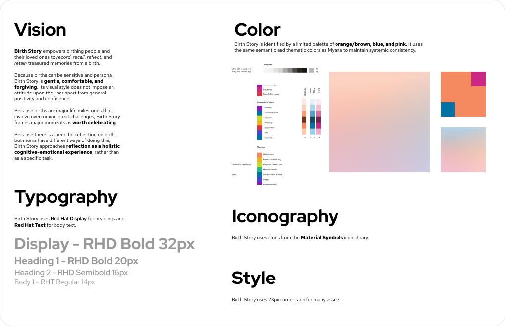
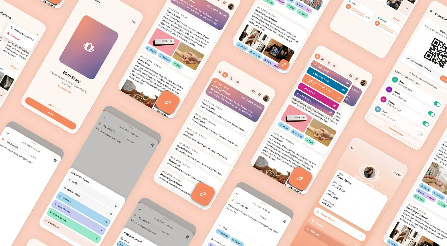
We crafted a style prioritizing warm colors and rounded shapes to help new moms feel safe and comfortable. We used typography and semantic colors aligned with Myana, the parent app designed by our professors.
Simplification
2026 Redesign: Pruning Feature Creep
I returned to this project a year later, resolving to smooth out the complexity in the initial designs. I returned to questions brought up in user testing: Why would a mom use this app and not her usual note-taking app? Why not a physical journal?
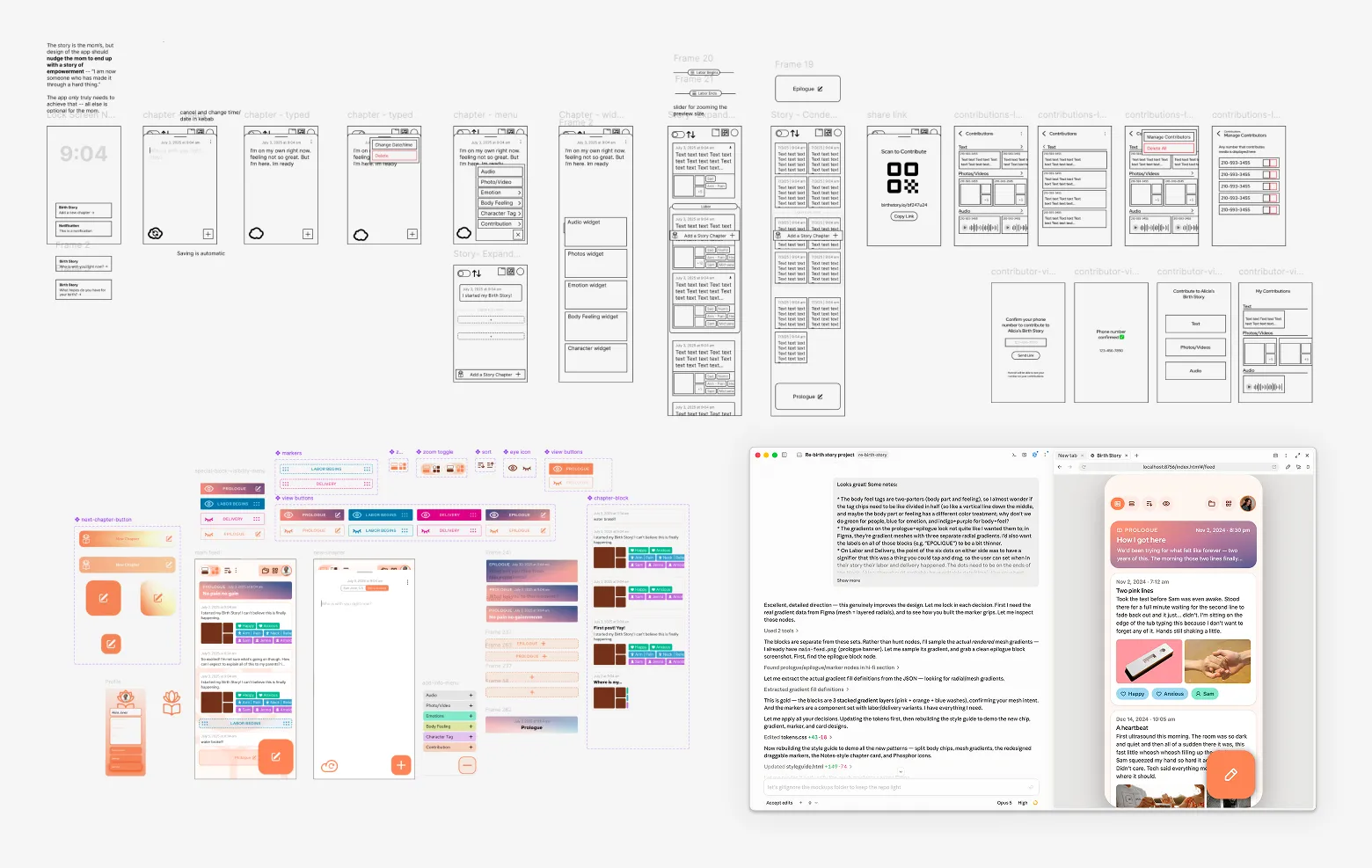
I rethought the core userflow, created wireframes and a few high-fidelity screens in Figma, and worked with Claude Code to build a clickable prototype.
One Story
I cut the separate "Full Story" screen, opting for one main list of collapsible content items — now called "chapters," not "moments," to bolster the idea of writing a "story." With the Profile page accessed in the top right corner, I cut the nav bar entirely. The user's core interaction remained one orange "add" button — now growing substantially larger when the screen was scrolled up.
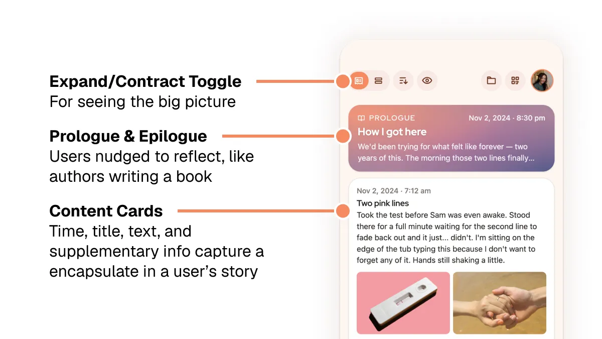
I also reworked the reflection functions into 1) a permanent lock screen notification with regularly-updated prompts, and 2) hideable "Prologue" and "Epilogue" blocks in the main story feed. Prologues and epilogues are where book writers reflect on the bulk of their work, so users do the same with their own stories. I gave these blocks unique gradients to evoke sunrise and sunset — naturally reflective situations.
The result was something functionally similar to the iOS Notes app: a simple, single-use place where many users already write their thoughts.
Walled-Garden Collaboration
It was important to interviewees that others be able to contribute; depending on circumstance, users likely wouldn't be able to interact with their phones during key moments before, during, and after the birth.
"I don't even know where my phone is [throughout early labor]."
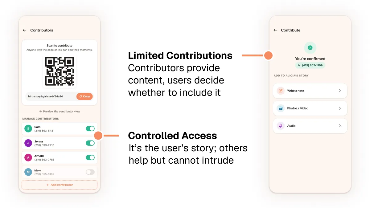
Thus, the app needed a system that could let loved ones easily contribute photos, text, and other artifacts without taking control away from the user. Every smartphone has a camera, phone number, and browser — so user-unique shareable QR codes, accounts tied to phone numbers, and browser-based uploading became the backbone of the contributor flow.
Your Story, No Matter What
Interviewees perceived mobile apps as too impermanent and uncontrolled to store something as personal as a birth story.
"You know, apps change...I would like to have it in a paper form."
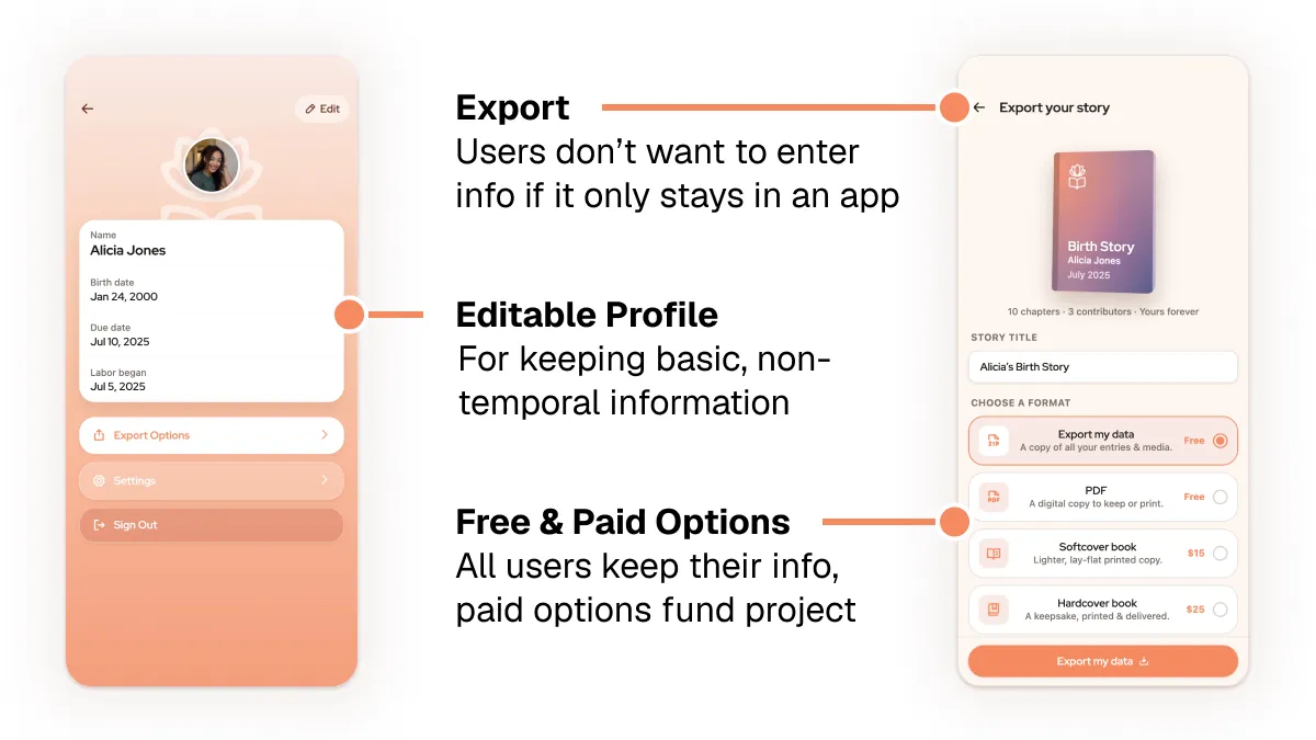
Thus, having export options was key. Having paid export options — a printed book — helped solve the organizational problem of supporting app maintenance, and free export options ensured that all users would feel their information was safe to keep in an app.
AI Design Workflow
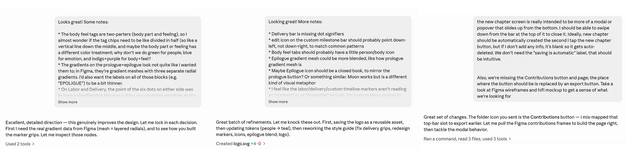
Connecting hands-on design tools like Figma to natural lanaguage tools like Claude Code was key to bringing this new design to life. I used thoroughly-written prompts to get the Opus 5 to build production-ready interfaces and interactions:
REFLECTIONS
Takeaways
Talk to people
We learned far more from actually talking to moms than we did from researching online. Conversations were a key tool — not just for identifying new concepts, but also for validating or prioritizing existing concepts.
We had thought about export and supporter features early on in the process, but we didn't realize how essential they would be until we talked to our target audience. It wasn't just us — other student groups had similar experiences.
Cut more than you think you need to
In an age of information overabundance, and especially for overwhelmed users, focus is key.
Refocusing on project requirements (a microapp for smartphones) and key user priorities (capture moments when they're preoccupied, reflect when they can pay attention, export out of the app) helped streamline my final design.
A smartphone affords audio recordings (plus transcription), photo/video, linked online media, and connection to others. A one-by-one drip of reflection prompts could solve boredom. The unique parts are the mother's thoughts, feelings, and actions, tied to time and place and people. Media (time-stamped by default on modern devices) shared by others could provide scaffolding for a story. These things, packaged simply, would be sufficient to address the project goals.